Typography as a Condition for Access
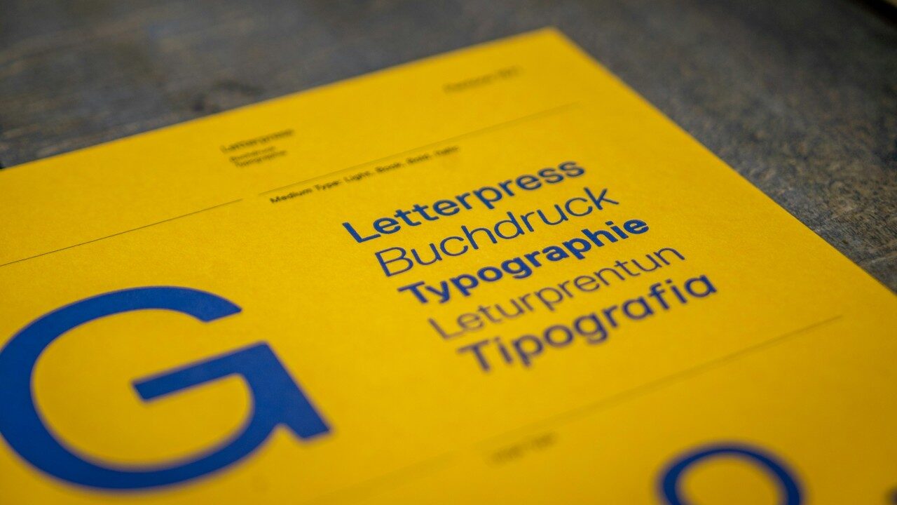
Have you ever struggled to read a poster or a social media post because the lettering just wasn't clear? That fairly common experience points to something important: when typography fails, so does access to information.
In visual design, typography is usually approached from its aesthetic or expressive side. But its core function — as a vehicle for information — makes it a central element in building communicational accessibility.
From that angle, choosing a typeface is never a neutral decision. It can make reading, understanding, and interpreting content easier, or harder. That holds true across many formats and contexts: subtitles in video, posters, books, and signage systems alike. In every case, typography shapes the conditions under which content can be accessed. It's not just a visual form — it's fundamentally a tool of mediation.
At the same time, typography doesn't just make information accessible — it also shapes how that information is perceived and interpreted. The right typeface can reinforce content through design, adding meaning, hierarchy, and clarity. In that sense, text design is never a minor detail; it directly shapes how we understand and receive what's being communicated.
Every typeface works as an interface: it's the point of contact between the text and the person reading it. Its design has a direct impact on legibility (how easily individual characters are recognized) and readability (how easily a block of text can be processed). Legibility relates to formal aspects — like how distinct characters are from one another, or x-height, for example — while readability involves variables like text organization, visual rhythm, and cognitive load.
As Robert Bringhurst put it: "Typography exists to honor content." From an accessibility standpoint, that means making sure content can actually be perceived and understood by as wide a range of people as possible.
Some criteria help improve the reading experience: clearly constructed characters, an appropriate text size, sufficient contrast between text and background, line spacing and letter spacing that support visual tracking, and line lengths that sustain a comfortable reading rhythm. Together, these reduce cognitive effort and widen the possibilities for access.
When it comes to choosing a typeface, some fonts stand out for their accessibility performance. Atkinson Hyperlegible, for instance, was designed specifically for people with low vision, prioritizing the distinction between similar characters. Ready is built for digital environments and balances clarity with strong readability across sizes. There are also typefaces developed for people with dyslexia, like OpenDyslexic or Lexend, which include specific features to support word recognition and reduce confusion while reading.
In a world where communication is increasingly mediated by screens and a wide range of use conditions, designing typography means taking on a broader responsibility. It's not about picking the "right" font — it's about building the conditions for reading, considering who's reading, in what context, and under what conditions.
At Sintagma, we design content with this in mind, carefully choosing typography for each specific context to make sure every piece is accessible. Because, ultimately, every typographic decision opens or closes a door to access.